Why Retail Store Layout Design Matters in Q2
April through June brings a predictable surge in shipping volume as businesses send inventory, graduates mail packages, and spring movers ship belongings. Most pack-and-ship retailers run the same floor plan year-round, missing the chance to test layout improvements when customer flow patterns shift. Thoughtful retail store layout design during this period directly addresses longer checkout lines, buried ancillary services that customers never notice, and missed revenue from printing, mailbox rentals, and notary offerings.
Physical space redesign costs less than a single month of digital advertising but directly influences revenue per transaction.
When customers wait in line behind someone negotiating customs forms, they skip the print station. When the notary desk sits hidden in back, walk-ins assume you don’t offer it. Spring 2026 offers the ideal testing window—high transaction volume provides real feedback on what works before summer peak hits.
Redesign now, cut wait times, and turn foot traffic into cross-service sales.
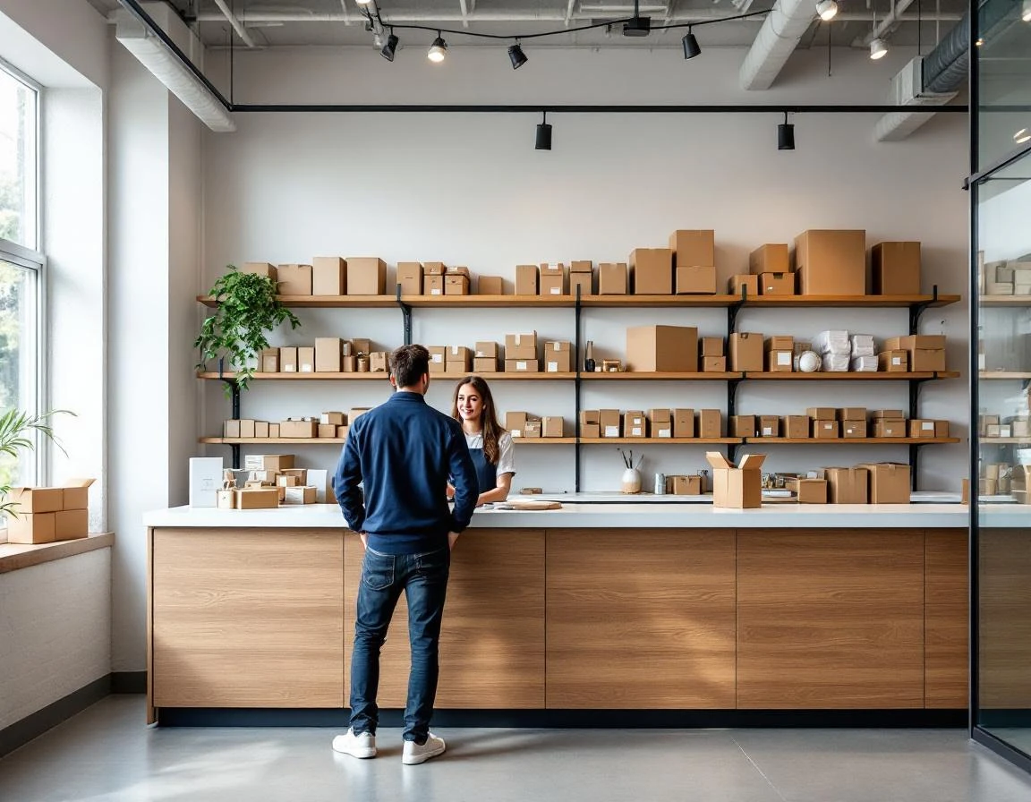
Audit Your Current Store Layout
Before you move a single counter or service station, map your store’s reality. Pick three typical days—two weekdays and one Saturday—and track customer movement during peak hours. Station yourself near the entrance during lunch (11:30 AM to 1:30 PM) and after-work rushes (4:30 PM to 6:30 PM). Sketch where customers pause, where lines form, and which service areas get bypassed. Mark zones on your floor plan: entry path, waiting area, pack-and-ship stations, print services, mailbox wall, and checkout counter.
Your POS system holds the second half of the story. Pull reports for average transaction time by service type, the number of customers who purchase only shipping versus those who add printing or notary services, and peak-hour transaction volume. Calculate your average checkout wait during busy periods—if customers routinely wait more than three minutes, your layout is costing you sales. Measure service adoption rates by comparing total transactions to multi-service transactions. This baseline data proves which layout changes will deliver measurable improvement.
Three Proven Zoning Strategies for Pack and Ship Store Design
The data you collected reveals patterns, but transforming those insights into physical layout changes requires deliberate design. Three zoning strategies address the most common flow problems in pack-and-ship stores while creating opportunities to expose customers to services they didn’t know you offered.
Entry and Intake Zone: Eliminate Decision Paralysis
Customers entering your store shouldn’t have to wait in line to figure out where to go. Install clear overhead signage that directs them to self-select their service category: shipping counter, print station, mailbox services, or notary. This simple change prevents the all-too-common scenario where someone picking up mail waits behind three customers shipping boxes.
Position your intake zone so staff can see the entire flow from entry to counter. When customers can route themselves to the right station immediately, wait times drop and frustration disappears. The intake zone also sets expectations—a visible queue management system tells customers how long they’ll wait before they commit to staying.
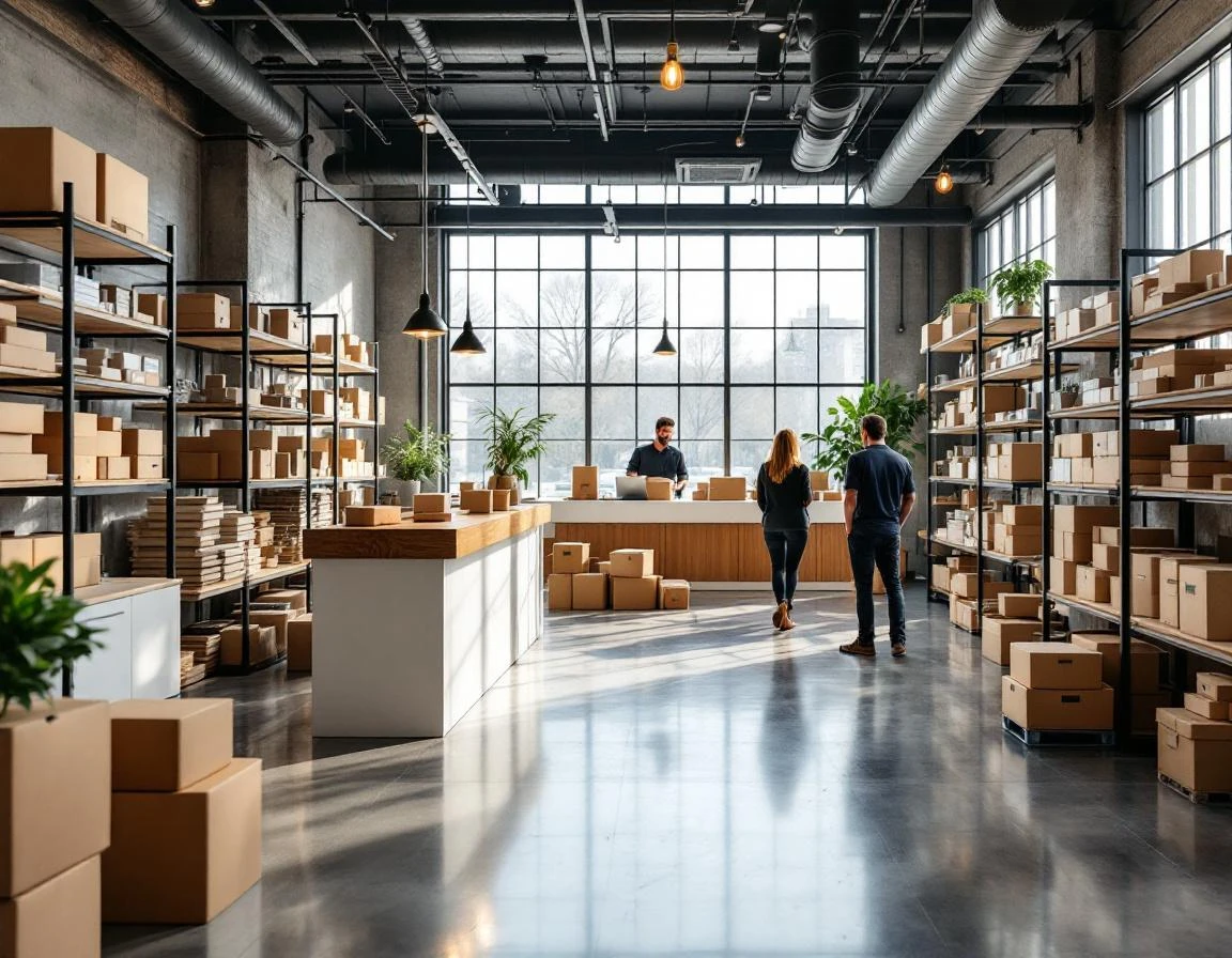
Service Cluster Design: Create Sightlines That Sell
Pack, ship, print, and mailbox services should occupy adjacent zones with clear sightlines between them. When a customer stands at the shipping counter, they should see the wide-format printer producing a banner or the mailbox wall. This passive exposure drives discovery—customers who came in to ship a box suddenly realize you offer poster printing or private mailbox rentals.
Clustering services in the middle of your store, rather than hiding print services in a back corner, increases auxiliary service adoption. Position your most visually interesting service—whether that’s custom printing or packaging supplies—where it catches attention from multiple angles. How to optimize retail space layout through service clustering turns every transaction into an opportunity for customers to learn what else you do.
Checkout Acceleration: Separate Express from Full-Service
Split your checkout into two lanes: express for pre-paid shipping labels, mailbox pickups, and quick transactions, and full-service for customers who need rate comparisons, packing help, or customs forms. This division prevents simple transactions from getting stuck behind complex ones.
Your full-service checkout becomes the upsell zone. Position ancillary displays—packing tape, bubble mailers, shipping insurance—within arm’s reach of the counter. When customers wait for dimensional weight calculations or customs paperwork, they browse these add-ons. Stores that redesign checkout to separate transaction complexity while showcasing ancillary products convert browsing into additional revenue per transaction.
Each of these three strategies directly contributes to the wait-time reduction and service adoption lift promised by spring layout redesigns. Entry zoning cuts decision time, service clustering drives cross-selling through visibility, and checkout separation accelerates simple transactions while creating upsell moments during complex ones.
Customer Flow Mapping Essentials
Your POS system already captures the raw data you need to understand customer movement. Start by pulling transaction timestamps filtered by service type for the past thirty days. Look for patterns: Are shipping customers arriving between 11 AM and 2 PM while print jobs cluster in early morning? Does mailbox traffic peak right after lunch? Group transactions into peak and off-peak windows, then compare the service mix during each period to see which customers overlap and which move through independently.
Next, identify where customers disengage before completing additional services. If shipping transactions rarely include printing or notary add-ons, your layout may be hiding those services from view. Walk your store during peak hours with a simple grid map of your floor. Mark congestion zones where customers wait or cluster. Note sightlines: Can someone at the shipping counter see your print display? Does the checkout queue block access to mailbox services? These observations reveal abandon points that transaction data alone won’t show.
Combine both data streams into a heat map overlaying your grid. Color-code high-traffic zones in red, moderate areas in yellow, and underutilized spaces in green. This visual baseline takes one week to build and requires nothing beyond your POS dashboard and careful observation. Once complete, you’ll have a clear picture of where customers move, where they wait, and which services remain invisible during their visit.
Cross-Selling Through Strategic Positioning
Retail environment customer experience improves when layout redesign turns physical space into a revenue engine.
Place complementary services where customers naturally encounter them—a printing station adjacent to the shipping counter increases printing add-ons, while notary signage positioned in queue areas boosts seasonal notary transactions.
Behavioral economics shows that customers focused on a primary task—shipping a package—often overlook secondary services unless prompted by proximity or sightline.
ParcelPuffin’s multi-service POS capability tracks which services sell together, revealing which layout adjustments drive adoption. When staff can see auxiliary service areas from the checkout counter, they mention those options during transactions. Mailbox rental brochures placed at checkout capture customers mid-transaction, and printing samples displayed in wait areas activate dormant demand. Data-driven staff training paired with intentional positioning multiplies cross-selling impact without adding labor hours.
Low-Cost Implementation for April Launch
Most layout improvements come from rearranging what you already own. Consider these quick-win changes:
- Move your shipping station closer to the entrance
- Reposition your checkout counter to create natural sightlines to notary or mailbox services
- Add directional floor decals and service category signs using printed vinyl instead of custom millwork
These changes account for the majority of flow improvements without requiring construction permits or capital investment.
Phase your redesign across three weeks in April to launch before May volume arrives:
- Week one: Reconfigure your entry zone with clear service signage and self-selection pathways
- Week two: Cluster related services together and adjust furniture placement to create discovery moments
- Week three: Separate express checkout from full-service transactions and position add-on displays near the payment counter
This staged approach keeps your store operational while you test each change.
Track three metrics weekly: average checkout time from queue to completion, percentage of transactions including two or more services, and revenue per transaction. Compare your April 1–7 baseline against post-redesign performance starting April 14. The natural traffic increase through May and June provides built-in testing volume to validate which layout adjustments drive the strongest results. ParcelPuffin POS captures transaction timestamps and service combinations automatically, giving you the data foundation to measure layout performance without manual tracking.